Homework 8
Sage Sularz
2025-03-19
Simulating and Fitting Data Distributions
1) Running the Sample Code with both a generated data set and my own
Check packages out of the library
library(ggplot2) # for graphics
library(MASS) # for maximum likelihood estimation
Generate fake data for sample run:
z <- rnorm(n=3000,mean=0.2)
z <- data.frame(1:3000,z)
names(z) <- list("ID","myVar")
z <- z[z$myVar>0,]
str(z)
summary(z$myVar)
Run with my own data:
z <- read.table("2024_insect_metabolism.csv",header=TRUE,sep=",")
str(z)
summary(z)
'data.frame': 42 obs. of 2 variables:
$ ID : chr "Male" "Male" "Male" "Male" ...
$ myVar: num 4.51 2.71 2.4 0.98 3.29 1.07 1.75 4.46 0.47 4.18 ...Plot the histogram
p1 <- ggplot(data=z, aes(x=myVar, y=..density..)) +
  geom_histogram(color="grey60",fill="cornsilk",size=0.2)
print(p1)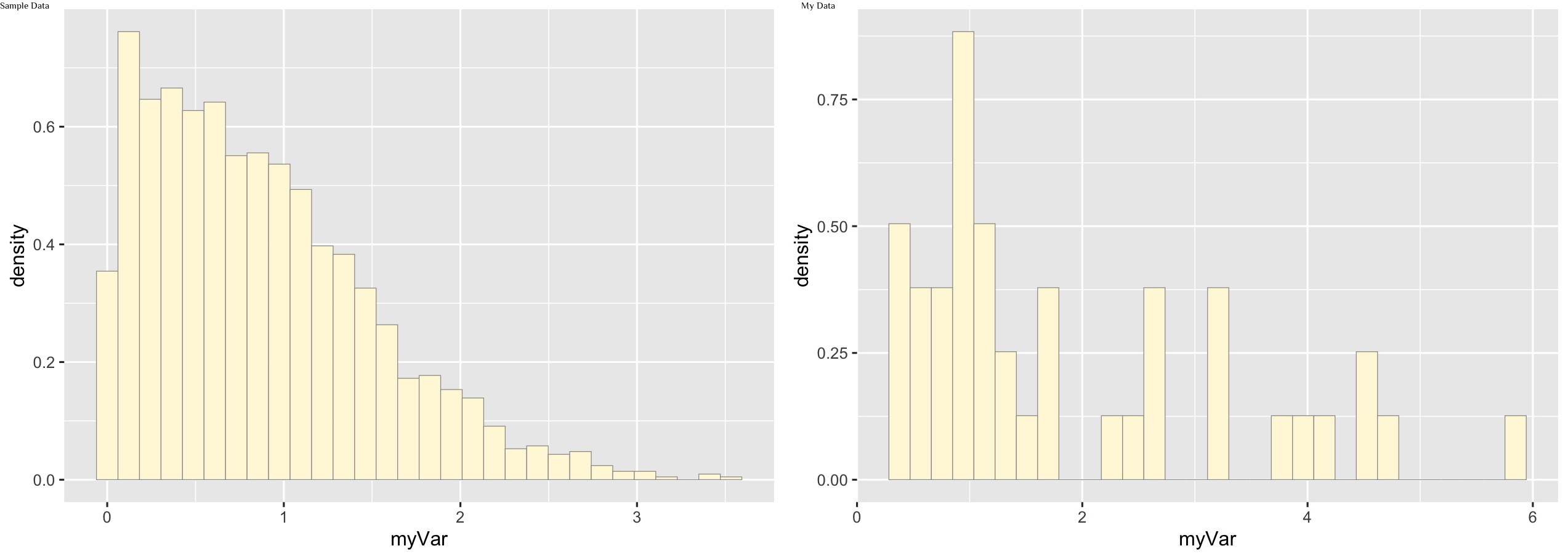
Add empirical density curve
p1 <-  p1 +  geom_density(linetype="dotted",size=0.75)
print(p1)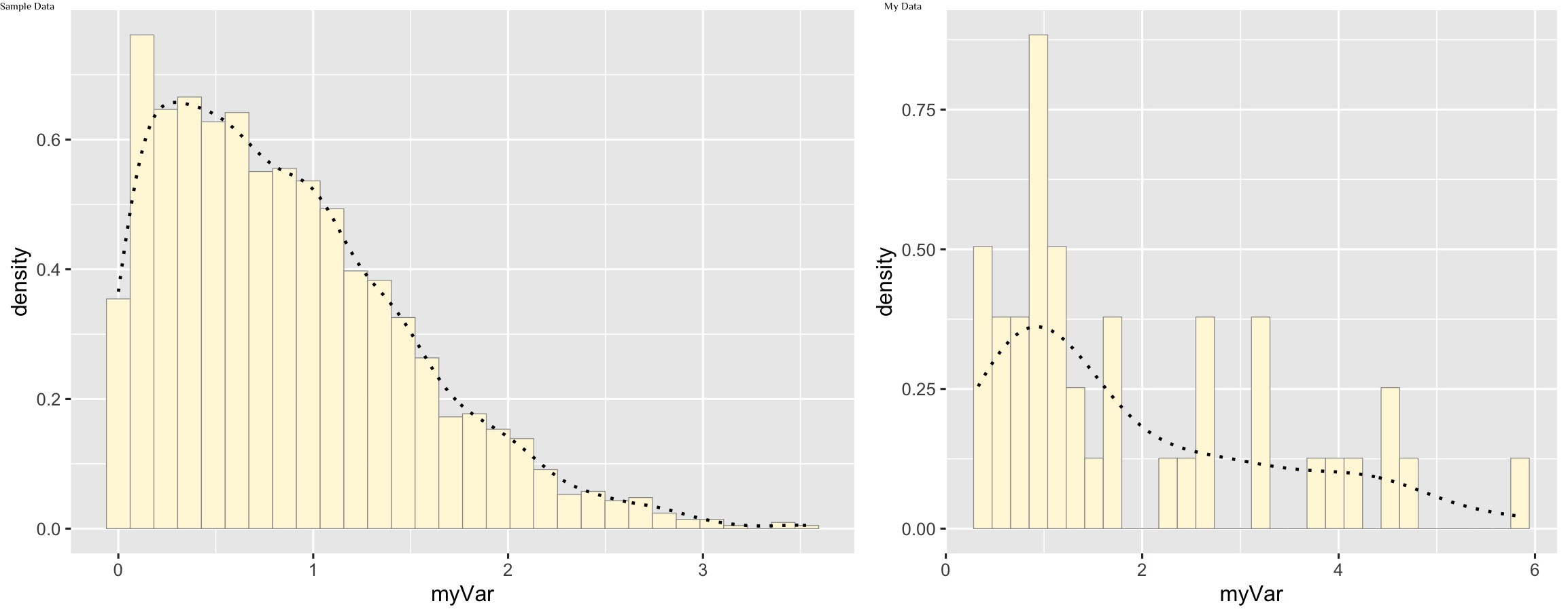
Maximum likelihood parameters for normal model
normPars <- fitdistr(z$myVar,"normal")
print(normPars)
str(normPars)
normPars$estimate["mean"] # note structure of getting a named attribute
Sample:
      mean          sd
  0.87089968   0.63978920
 (0.01545367) (0.01092739)
My Data:
     mean         sd
  1.8985714   1.4326143
 (0.2210572) (0.1563110)
Plot normal probability density
meanML <- normPars$estimate["mean"]
sdML <- normPars$estimate["sd"]

xval <- seq(0,max(z$myVar),len=length(z$myVar))

 stat <- stat_function(aes(x = xval, y = ..y..), fun = dnorm, colour="red", n = length(z$myVar), args = list(mean = meanML, sd = sdML))
 p1 + stat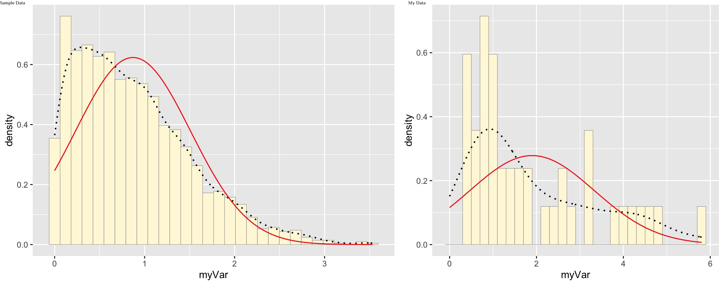
Plot exponential probability density
expoPars <- fitdistr(z$myVar,"exponential")
rateML <- expoPars$estimate["rate"]

stat2 <- stat_function(aes(x = xval, y = ..y..), fun = dexp, colour="blue", n = length(z$myVar), args = list(rate=rateML))
 p1 + stat + stat2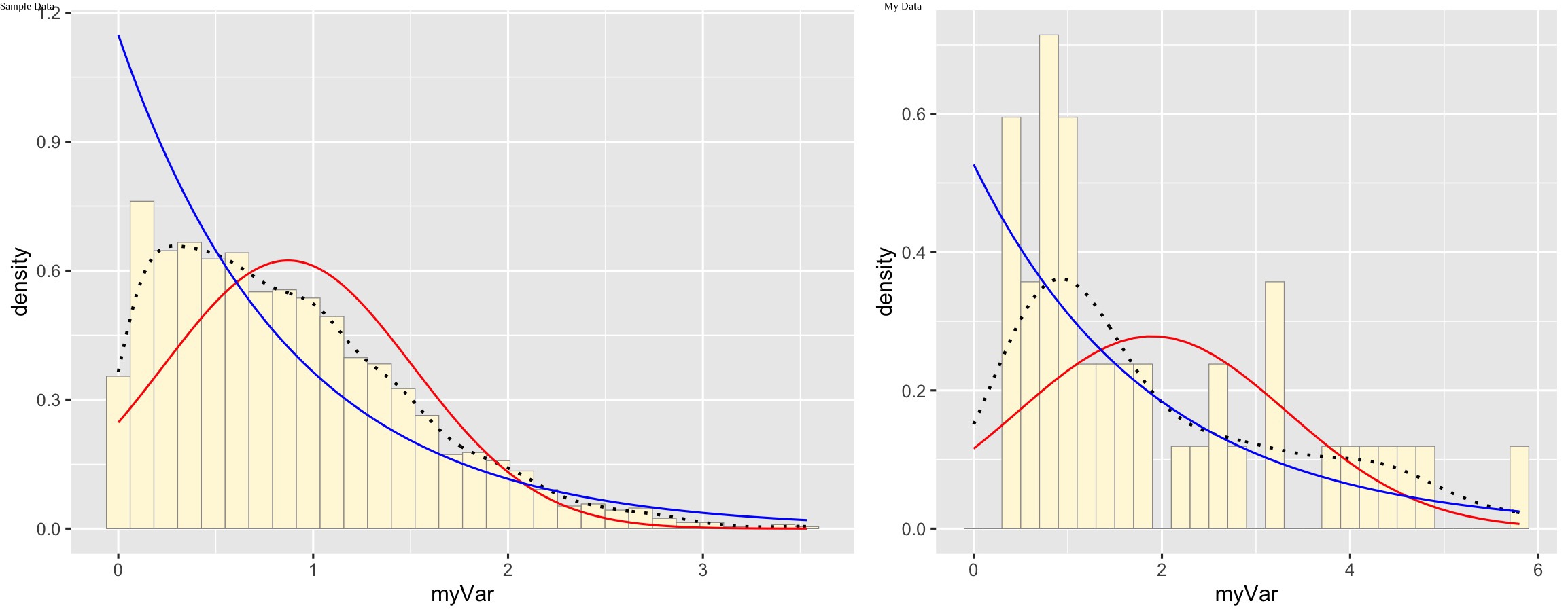
Plot uniform probability density
stat3 <- stat_function(aes(x = xval, y = ..y..), fun = dunif, colour="darkgreen", n = length(z$myVar), args = list(min=min(z$myVar), max=max(z$myVar)))
 p1 + stat + stat2 + stat3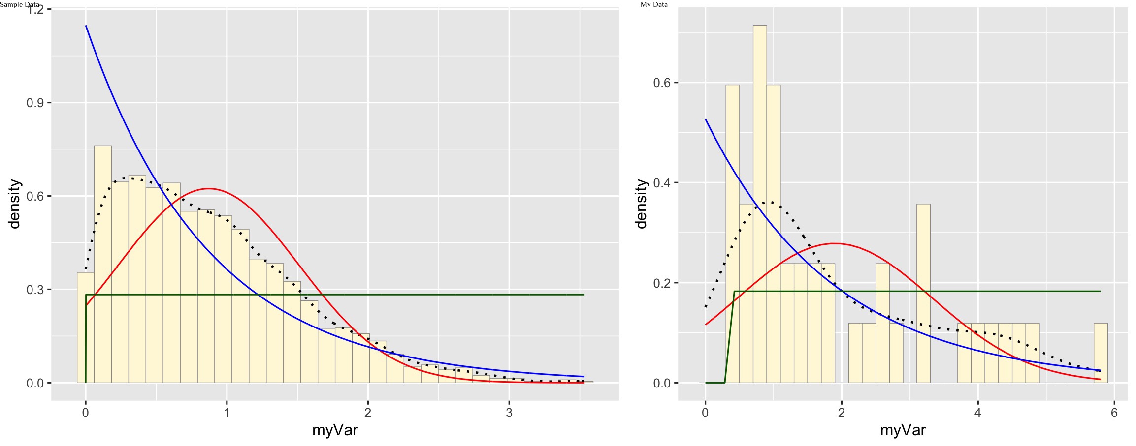
Plot gamma probability density
gammaPars <- fitdistr(z$myVar,"gamma")
shapeML <- gammaPars$estimate["shape"]
rateML <- gammaPars$estimate["rate"]

stat4 <- stat_function(aes(x = xval, y = ..y..), fun = dgamma, colour="brown", n = length(z$myVar), args = list(shape=shapeML, rate=rateML))
 p1 + stat + stat2 + stat3 + stat4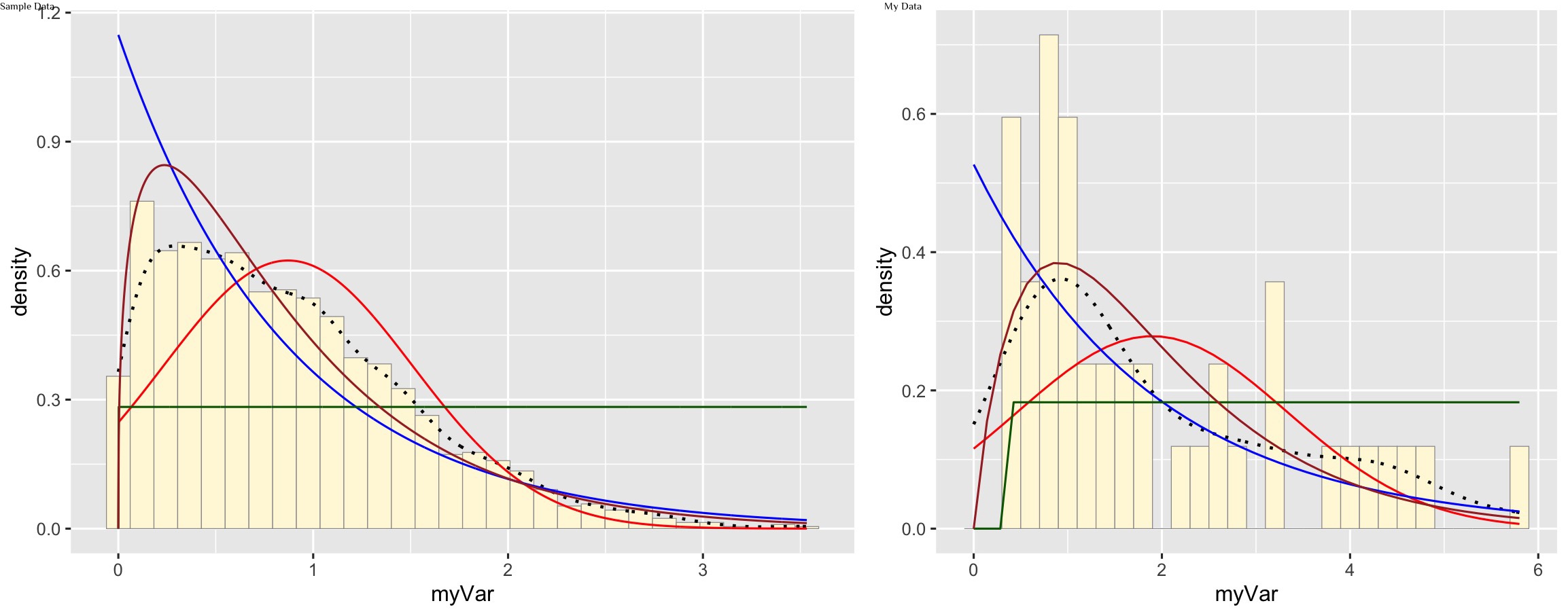
Plot beta probability density
pSpecial <- ggplot(data=z, aes(x=myVar/(max(myVar + 0.1)), y=..density..)) +
  geom_histogram(color="grey60",fill="cornsilk",size=0.2) +
  xlim(c(0,1)) +
  geom_density(size=0.75,linetype="dotted")

betaPars <- fitdistr(x=z$myVar/max(z$myVar + 0.1),start=list(shape1=1,shape2=2),"beta")
shape1ML <- betaPars$estimate["shape1"]
shape2ML <- betaPars$estimate["shape2"]

statSpecial <- stat_function(aes(x = xval, y = ..y..), fun = dbeta, colour="orchid", n = length(z$myVar), args = list(shape1=shape1ML,shape2=shape2ML))
pSpecial + statSpecial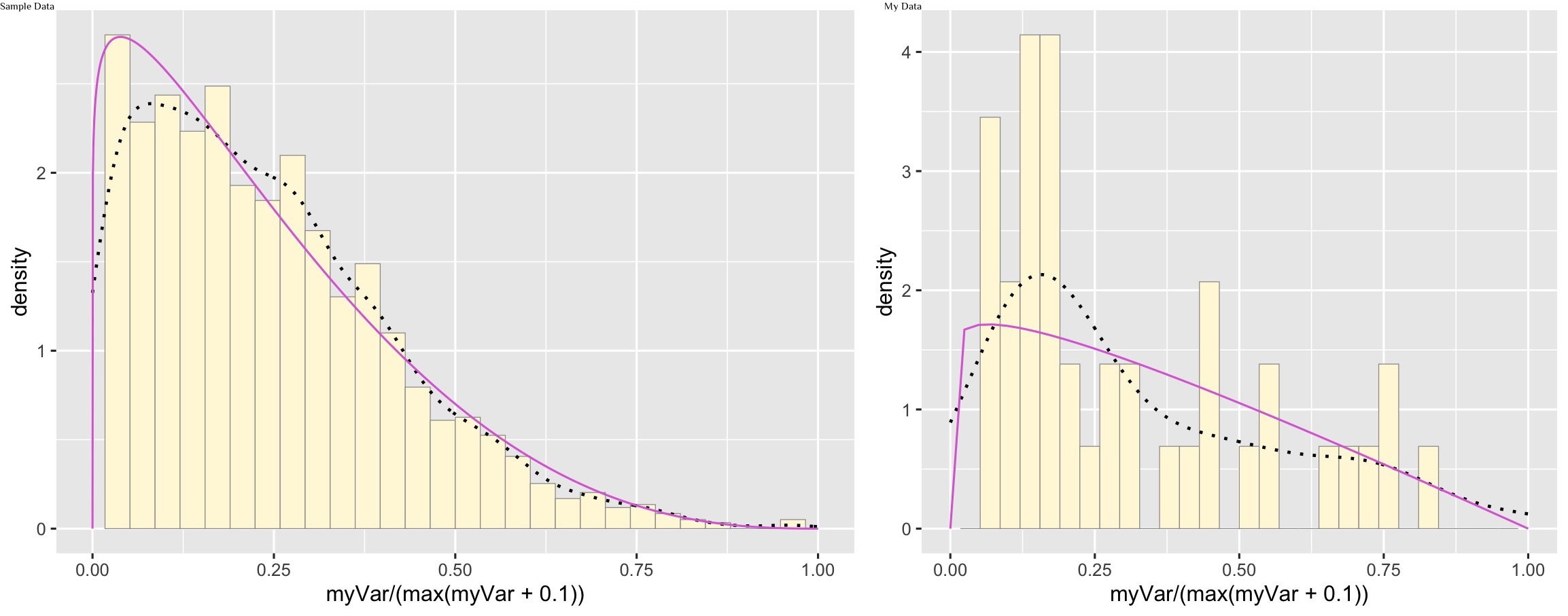
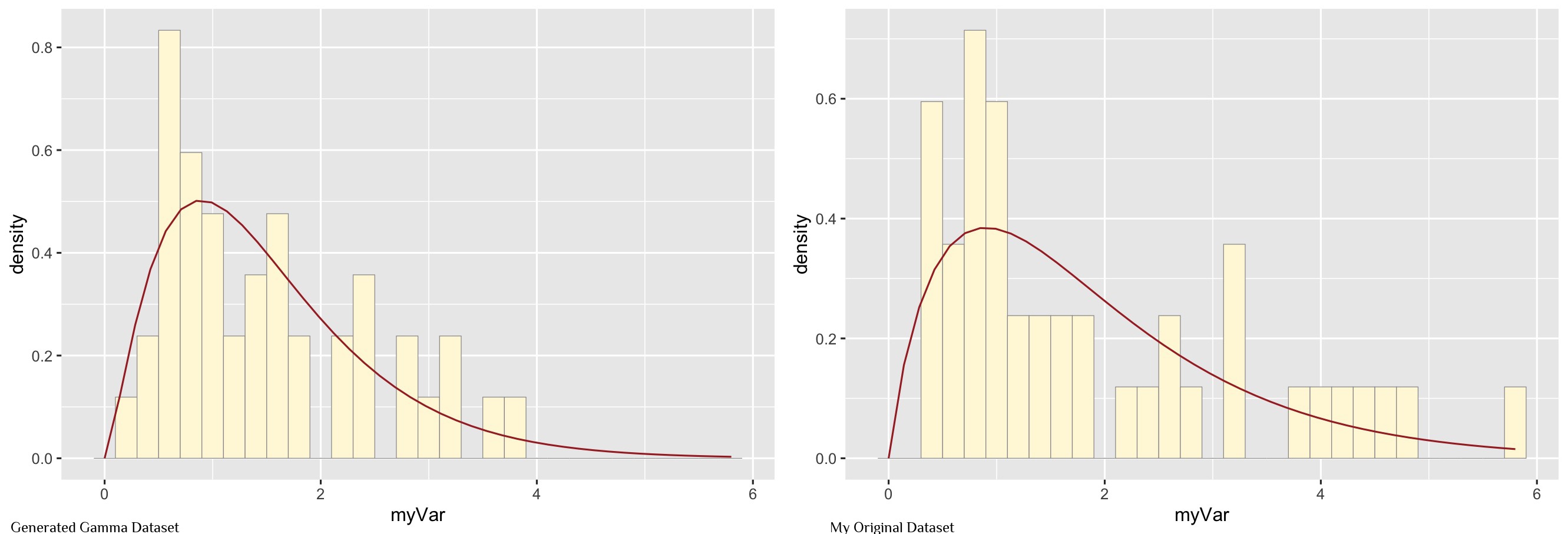
2) Finding the best-fitting distribution for my data set
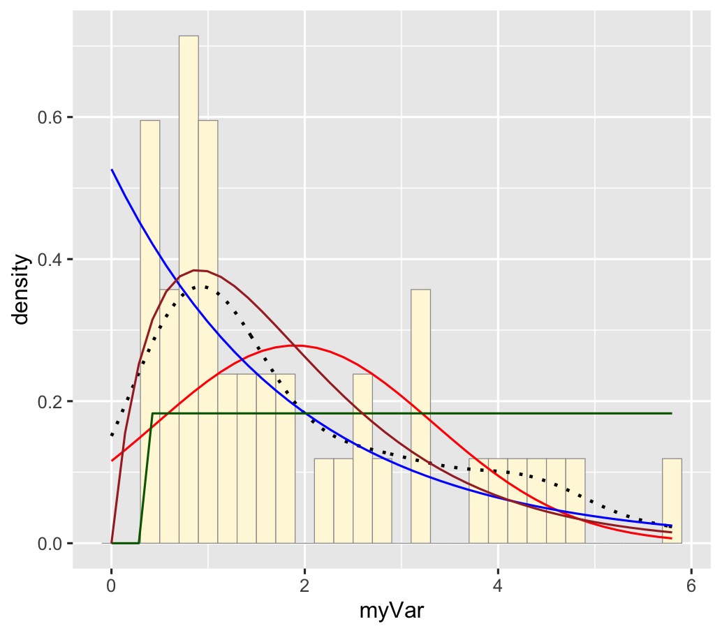
My data is best represented by the gamma density curve (shown in brown)
3) Simulate a new data set using a gamma distribution
Maximum likelihood parameters for a gamma distribution
gamPars <- fitdistr(z$myVar,"gamma")
print(gamPars)
str(gamPars)
gamPars$estimate["shape"]
shape rate
1.8992323 1.0003482
(0.3836109) (0.2310198)Generate new data set
z <- rgamma(n=42,shape=1.8992323,rate=1.0003482)
z <- data.frame(1:42,z)
names(z) <- list("ID","myVar")
z <- z[z$myVar>0,]
str(z)
summary(z$myVar)
Plot the new data set and compare to my original data